Data Analysis Techniques That Actually Work in 2026
By the InfiniSynapse Data Team · Last updated: 2026-07-09 · We build an AI-native data analysis platform and apply these techniques in production daily; this catalog reflects what genuinely earns its place in real analysis.
Table of Contents
- TL;DR
- How We Evaluated Data Analysis Techniques
- Techniques Organized by Purpose
- Summarizing Techniques
- Comparing Techniques
- Relationship Techniques
- Trend and Time Techniques
- Segmentation Techniques
- Techniques Compared by Purpose
- How AI Applies Techniques
- Combining Techniques in Practice
- Building Your Technique Toolkit
- Techniques Scorecard
- Frequently Asked Questions
- Conclusion
TL;DR
Direct answer: the data analysis techniques that actually work are the practical procedures for summarizing, comparing, finding relationships, tracking trends, and segmenting data. Rather than memorizing an exhaustive list, learn the handful that answer the most common questions, and match each technique to the job it does best.
Who this is for: anyone building a practical toolkit of data analysis techniques.
What you'll learn: how we evaluated techniques, how to organize them by purpose, the key techniques in each group, comparison tables, and how AI applies them.
This guide sits within the data analysis fundamentals hub; for the higher-level approaches, see data analysis methods. For related depth in this pillar, see A Data Analysis Example, Start to Finish.
How We Evaluated Data Analysis Techniques
We assessed data analysis techniques for this guide using criteria that mirror what production analysts actually reach for, not academic catalogs alone. Each technique was checked against four dimensions: whether it answers a common business question directly, whether a competent analyst can execute it on messy real data, whether the output communicates clearly to stakeholders, and whether simpler alternatives would have sufficed.
We cross-referenced the underlying activity with the Wikipedia overview of data analysis, which frames analysis as inspecting, cleaning, transforming, and modeling data to surface useful information. We aligned autonomy expectations with IBM's augmented analytics overview, which tracks how AI-assisted workflows reshape which techniques teams delegate versus hand-apply. The Stanford HAI AI Index documents how quickly agent-assisted analysis moved from research into daily practice. For occupational context we referenced the Bureau of Labor Statistics profile for data analysts and hiring-trend data from LinkedIn's 2025 Future of Recruiting report, which notes that demonstrated analytical output increasingly influences hiring alongside formal credentials.
The table below summarizes the evaluation dimensions we apply when recommending data analysis techniques to a team.
| Evaluation dimension | Why it matters in 2026 | What we tested |
|---|---|---|
| Question coverage | Techniques earn their place by answering real questions | Map each technique to summarizing, comparing, relating, trending, or segmenting |
| Execution speed | Analysts need answers under deadline | Time to first insight on a 500K-row export |
| Stakeholder clarity | Analysis without narrative creates little value | Can a non-technical reader grasp the chart or table |
| Simplicity preference | Sophistication adds risk without value | Whether a simpler technique would have answered the question |
| Data-quality tolerance | Real data is messy | Performance when nulls, duplicates, or inconsistent labels appear |
| Reproducibility | Recurring reports must rerun | Same technique on refreshed data yields consistent logic |
| Scale handling | Techniques choke at different row counts | Spreadsheet vs SQL vs Python suitability |
| Agent compatibility | Routine technique application can delegate | Compare hand-applied vs AI-assisted execution on known answers |
Techniques Organized by Purpose
The most practical way to learn data analysis techniques is to organize them by the job they do rather than as a flat list. A technique earns its place by answering a common question well, so grouping techniques by purpose, summarizing, comparing, finding relationships, tracking trends, and segmenting, makes the toolkit both memorable and immediately useful. You reach for a technique based on what you are trying to learn.
This purpose-first organization keeps data analysis techniques from feeling overwhelming. There are hundreds of named techniques, but most everyday analysis relies on a small core within each purpose group. Learning that core deeply, consistent with the disciplined process described in the Wikipedia overview of data analysis, serves you far better than a shallow acquaintance with many exotic data analysis techniques you will rarely use. Master the common ones, and add specialized techniques only when a specific question genuinely demands them.
Summarizing Techniques
Summarizing data analysis techniques condense a mass of data into understandable figures, and they are the most frequently used group. Calculating averages, medians, totals, and percentages answers a huge share of everyday questions directly. Frequency counts and distributions show how values spread, while pivot tables cross-tabulate data to summarize it along two dimensions at once.
These summarizing data analysis techniques are deceptively powerful precisely because they are simple. A well-constructed pivot table or a thoughtful set of summary statistics often answers a business question completely, with no need for anything more elaborate. The skill in summarizing lies less in the technique itself than in choosing which summary actually addresses the question, and in presenting it clearly. Mastering these basic data analysis techniques first gives you a foundation that covers most real needs before you ever reach for advanced methods.
Comparing Techniques
Comparing data analysis techniques answer questions about differences between groups, which is one of the most common analytical needs. Simple comparisons of averages or rates between segments, such as conversion rates across channels, reveal where meaningful differences lie. Cross-tabulation compares categories against one another, and cohort comparison tracks how different groups behave over time.
When comparisons need to establish whether a difference is real rather than chance, comparing data analysis techniques extend into statistical tests, which judge significance. But for many practical questions, a clear comparison of well-defined groups is enough to guide a decision. The key with comparing data analysis techniques is ensuring the groups are defined consistently and the comparison is fair, since comparing groups that differ in hidden ways produces misleading conclusions. Fair, clear comparison is one of the most decision-relevant things analysis can provide.
Relationship Techniques
Relationship data analysis techniques explore how variables move together, answering whether and how one thing relates to another. Scatter plots visualize the relationship between two variables, revealing patterns the eye grasps instantly. Correlation quantifies the strength and direction of a linear relationship, while regression goes further to model how one variable depends on others.
A crucial caution with relationship data analysis techniques is that correlation does not imply causation. Two variables moving together may share a common cause, or the link may be coincidental, so relationship techniques reveal associations that require careful interpretation before any causal claim. Used well, relationship data analysis techniques surface the drivers worth investigating and the patterns worth acting on, but the interpretation demands the judgment to distinguish a genuine driver from a spurious correlation, which is where analytical experience matters most.
Trend and Time Techniques
Trend and time data analysis techniques examine how data changes over time, answering questions about direction, seasonality, and change. Time-series plots reveal trends and cycles at a glance, moving averages smooth out noise to expose the underlying direction, and growth-rate calculations quantify how fast something is changing. These techniques are essential wherever timing matters.
Business questions frequently hinge on trend and time data analysis techniques, since understanding whether a metric is rising, falling, or cycling seasonally drives many decisions. A common pitfall is mistaking short-term noise for a real trend, which trend techniques like moving averages help guard against by separating signal from fluctuation. Applying trend and time data analysis techniques thoughtfully, with attention to seasonality and the difference between noise and genuine change, turns a confusing series of numbers into a clear story about direction over time.
Segmentation Techniques
Segmentation data analysis techniques divide data into meaningful groups so that patterns hidden in the aggregate become visible. Simple segmentation splits data by known categories, such as region or customer type, to compare their behavior. More advanced segmentation, like clustering, discovers natural groupings in the data that were not defined in advance.
Segmentation data analysis techniques are powerful because aggregates often conceal important differences; an overall average can mask that two subgroups behave in opposite ways. By segmenting, an analyst reveals these hidden patterns and enables targeted action. Effective segmentation data analysis techniques require choosing segments that are meaningful for the decision at hand, since arbitrary segments produce noise rather than insight.
Techniques Compared by Purpose
The table below maps the core data analysis techniques to their purpose, typical tooling, and authoritative references.
| Purpose | Core technique | Typical tooling | Authoritative reference |
|---|---|---|---|
| Summarizing | Averages, medians, pivot tables | Excel, Google Sheets, SQL | Wikipedia descriptive statistics |
| Comparing | Group comparisons, cross-tabs, t-tests | SQL, pandas, Tableau | American Statistical Association |
| Relationships | Scatter plots, correlation, regression | matplotlib, seaborn, statsmodels | scikit-learn regression guide |
| Trends | Time-series plots, moving averages, YoY growth | SQL window functions, Power BI | Forecasting principles (Hyndman) |
| Segmentation | Cohort splits, RFM, k-means clustering | SQL, pandas, scikit-learn | scikit-learn clustering guide |
| Distribution | Histograms, box plots, percentiles | Tableau, matplotlib, Excel | Wikipedia box plot |
| Ranking | Top-N, Pareto (80/20) analysis | SQL ORDER BY, pivot tables | Wikipedia Pareto principle |
| Funnel | Step-by-step conversion analysis | Google Analytics, SQL, Mixpanel | Google Analytics documentation |
Use this table as a checklist when choosing data analysis techniques for a new question. Start with the purpose row that matches your need, then pick the simplest technique in that row that genuinely answers the question.
Practical example: a marketing analyst comparing channel performance applies data analysis techniques in sequence: summarizing total conversions per channel, comparing conversion rates with a fair denominator, and segmenting by customer type to reveal that paid social drives volume but organic search drives higher-value repeat buyers. She presents a single dashboard with inspectable SQL behind each chart—exactly the demonstrated-outcome evidence that Harvard Business Review's skills-based hiring research describes as increasingly decisive in hiring and promotion decisions.
How AI Applies Techniques
In 2026, AI-native tools apply data analysis techniques from a plain-language goal, selecting and executing the appropriate procedure without the analyst manually coding it. Ask which segments differ most, and an agent can apply the right comparing and segmentation data analysis techniques, presenting the result with an inspectable trail that lets you verify the approach.
The human frames the question and judges whether the technique and result make sense, while the mechanical execution is automated. IBM's augmented analytics overview describes this as augmented rather than replaced human judgment. The Stanford HAI AI Index documents how reliably these tools apply standard data analysis techniques, freeing analysts to focus on interpretation.
Combining Techniques in Practice
Real analysis rarely uses a single technique in isolation; instead, it chains several to answer a question thoroughly. A typical investigation might start by summarizing the data to get oriented, then compare groups to locate a difference, then explore the relationship driving that difference, and finally segment to see whether it holds across subgroups. Each step narrows and sharpens the understanding, and the sequence matters as much as any individual step.
Chaining techniques well requires letting each result guide the next choice. A surprising comparison suggests a relationship worth examining; an interesting relationship suggests segments worth isolating. This responsive sequencing, following the data where it leads while keeping the original question in view, is what turns a collection of individual procedures into a coherent analysis. The skill is not in knowing exotic techniques but in fluidly combining a handful of common ones in response to what each reveals, building toward an answer that no single technique could produce on its own.
Building Your Technique Toolkit
For someone developing their skills, the wise path is to build a toolkit deliberately rather than trying to learn everything at once. Start by mastering the summarizing basics, since they cover the largest share of real questions, then add comparing and relationship techniques, which handle most of the rest. Only after these are second nature does it pay to invest in more specialized procedures for the specific questions your work demands.
A practical toolkit favors depth in the common techniques over breadth across rare ones. An analyst who can construct a clear pivot, compare groups fairly, read a scatter plot honestly, separate trend from noise, and segment meaningfully can answer the great majority of analytical questions confidently. Exotic procedures have their place for specialized problems, but they are added as needed rather than learned upfront. Building the toolkit this way, common techniques first and specialized ones on demand, produces a capable analyst faster than trying to survey the entire field at once.
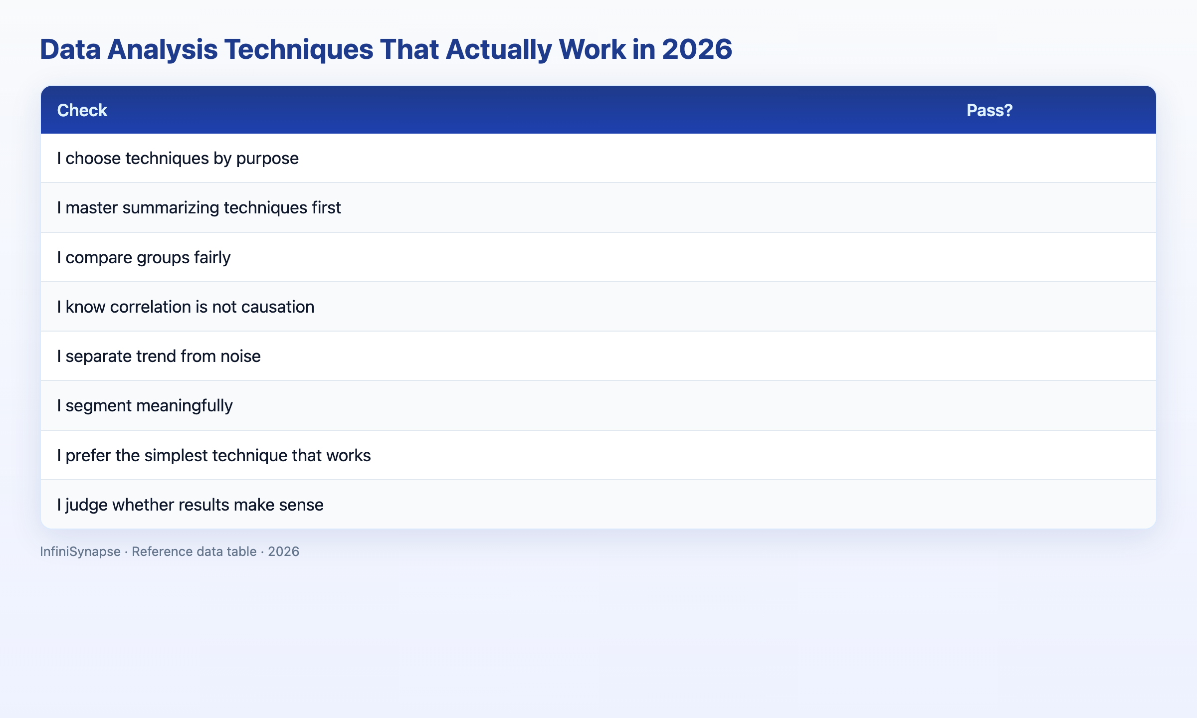
Techniques Scorecard
Assess your technique toolkit (1 point each):
| Check | Pass? |
|---|---|
| I choose techniques by purpose | |
| I master summarizing techniques first | |
| I compare groups fairly | |
| I know correlation is not causation | |
| I separate trend from noise | |
| I segment meaningfully | |
| I prefer the simplest technique that works | |
| I judge whether results make sense |
6–8: solid toolkit. 3–5: reinforce a group. Below 3: master the summarizing basics.
Frequently Asked Questions
What are the most useful procedures for everyday work?
The most useful data analysis techniques are the practical procedures for summarizing (averages, pivots), comparing groups, finding relationships (correlation, regression), tracking trends over time, and segmenting data. Rather than memorizing hundreds, learn the small core within each purpose group deeply, since these answer the majority of everyday analytical questions.
How do I choose the right procedure?
Choose a data analysis technique by the job you need done: summarizing to condense data, comparing to find group differences, relationship techniques to see how variables move together, trend techniques for change over time, and segmentation to reveal hidden subgroups. Match the technique to the question and prefer the simplest one that works.
What is the difference between methods and techniques?
Data analysis methods are broad systematic approaches like regression or thematic analysis, while techniques are the specific procedures used within them, such as a chart type or a calculation. You choose a method based on your question and data, then apply specific techniques to execute it, though the terms often blur in practice.
Why does correlation not imply causation?
In data analysis techniques, correlation measures that two variables move together, but that association can arise from a shared common cause or coincidence rather than one variable causing the other. Establishing causation requires careful design beyond a correlation, so relationship techniques reveal associations that demand cautious interpretation before any causal claim is made.
How do AI tools apply these procedures?
AI-native tools apply data analysis techniques from a plain-language goal, selecting and executing the appropriate procedure, like a comparison or segmentation, without manual coding, and presenting the result with an inspectable trail. The human frames the question and judges whether the technique and result make sense, while the mechanical execution is automated and accelerated.
Conclusion
The data analysis techniques that actually work are the practical procedures for summarizing, comparing, finding relationships, tracking trends, and segmenting, and the skill is matching each to the job while preferring the simplest that answers the question. In 2026, AI-native tools apply these techniques from a plain-language goal while humans supply the framing and judgment.
To see techniques applied automatically, read the complete data analysis guide and what AI-native data analysis means, then try the InfiniSynapse web app free on registration, no credit card required.