Tableau Data Analysis Tool: Strengths and Limits (2026)
By the InfiniSynapse Data Team · Last updated: 2026-07-09 · We build an AI-native data analysis platform and use Tableau alongside it on real projects; this assessment reflects hands-on use, not a sponsored review.
Table of Contents
- TL;DR
- How We Evaluated Tableau
- What Tableau Is Built For
- Named Tools Compared
- Where Tableau Excels
- Where Tableau Falls Short
- Tableau and the Preparation Gap
- How AI-Native Agents Complement Tableau
- Getting Started With Tableau the Right Way
- When to Choose a Different Tool
- Selection Scorecard
- Practical Next Steps
- Frequently Asked Questions
- Conclusion
TL;DR
Direct answer: Tableau is an excellent Tableau data analysis tool for visualization and dashboard sharing, with best-in-class charting and a gentle drag-and-drop model. Its limits are data preparation, autonomy, and the assumption of clean, modeled input, so it works best paired with a preparation layer or an AI-native agent.
Who this is for: teams evaluating the Tableau data analysis tool and wanting an honest strengths-and-limits assessment.
What you'll learn: how we evaluated Tableau, what it is built for, a named comparison with Power BI and Looker, where it excels and falls short, the preparation gap, and where an AI-native agent fills the gaps.
This assessment sits within the data analysis tools hub. For the free edition specifically, see Tableau Public for data analysis. For related depth in this pillar, see Data Analysis Tools Tableau: Where It Fits in 2026.
How We Evaluated Tableau
We assessed the Tableau data analysis tool against criteria that predict whether it survives a year in production stacks, not demo conditions alone. Each dimension was tested on real customer-style workloads: visualization quality and interactivity, exploration speed on modeled data, data-preparation expectations, sharing and governance features, and whether the tool supports AI-assisted workflows upstream. We cross-referenced those requirements with the Bureau of Labor Statistics occupational profile for data analysts, which lists communication and technical skills as core competencies, and hiring-trend data from LinkedIn's 2025 Future of Recruiting report, which notes that skills assessments and portfolio evidence increasingly influence hiring alongside formal credentials.
How We Evaluated Tableau: In Practice
The evaluation treated Tableau as a visualization layer, not an end-to-end platform. That framing matches how the product is documented at help.tableau.com and how it is categorized in IBM's augmented analytics overview. Judging the Tableau data analysis tool by the job it was built for—turning modeled data into interactive, shareable visualizations—produces a fairer assessment than expecting it to clean messy sources or plan multi-step analysis on its own.## What Tableau Is Built For
The Tableau data analysis tool was designed around one job done exceptionally well: turning modeled data into interactive, shareable visualizations. Its drag-and-drop interface lets a user build a chart in seconds without code, and its dashboards are polished enough for executive audiences. Understanding this focus is the key to using it well, because Tableau is a presentation and exploration layer, not an end-to-end analysis engine.
That focus places the Tableau data analysis tool firmly in the visualization tier described in IBM's augmented analytics overview. It addresses the communication stage of the process outlined in the Wikipedia data analysis overview—the stage where insight becomes something others can see and act on. The official product overview is at tableau.com/products/desktop, and certification details for analysts are at Tableau certification.
Named Tools Compared
The Tableau data analysis tool rarely stands alone. Teams compare it against Power BI and Looker when choosing a BI layer. The table below scores the three on dimensions that matter in 2026 production stacks.
| Tool | Visualization | Ecosystem fit | Preparation | Best for | Official docs |
|---|---|---|---|---|---|
| Tableau Desktop / Server | Excellent | Cross-platform | Limited | Visual polish, exploration speed | Tableau help |
| Power BI | Very good | Microsoft 365 / Azure | Limited (Power Query helps) | Microsoft shops, price | Power BI documentation |
| Looker | Good (modeled metrics) | Google Cloud | Engineered (LookML) | Governed, modeled metrics | Looker documentation |
Tableau generally leads on visual flexibility and exploration speed. Power BI leads on price and Microsoft-ecosystem integration, with Power Query providing more built-in preparation than Tableau offers natively. Looker leads when metrics must be centrally modeled and governed through LookML. None of these tools replaces a preparation layer for messy, multi-source raw data—a point our top data analysis platforms guide develops in full.
Practical example: a five-person analytics team that models revenue metrics in SQL upstream, connects the clean dataset to Tableau, and publishes one executive dashboard with three focused views can answer board questions in a single meeting. The preparation discipline—not the chart polish alone—is what prevents the embarrassing wrong-number incident that Harvard Business Review's skills-based hiring research implicitly rewards when teams hire analysts who can defend their figures.
Where Tableau Excels
The Tableau data analysis tool leads on three fronts. First, visual quality: its charts are flexible, interactive, and genuinely beautiful, which matters when the audience is leadership deciding on the strength of what they see. Second, exploration speed: an analyst can slice a modeled dataset a dozen ways in minutes, testing hypotheses visually far faster than by writing queries.
Third, distribution. Once a dashboard is built, the Tableau data analysis tool shares it widely with interactivity intact, so non-analysts can filter and explore rather than passively read a static image. This combination—beautiful visuals, fast exploration, and broad interactive distribution—is why Tableau became a category standard and why it remains a strong choice for reporting-heavy teams. When visualization and sharing are your bottleneck, few tools match it. The Stanford HAI AI Index notes how visualization literacy has become a baseline expectation across analytics roles.
Where Tableau Falls Short
The same focus that makes the Tableau data analysis tool excellent at visualization makes it weak elsewhere. Data preparation is the clearest gap: Tableau assumes the data arriving is already clean and modeled, and while it offers light shaping, it is not built to wrangle messy, multi-source raw data. Teams routinely pair it with a separate preparation step for this reason.
Autonomy is the second gap. The Tableau data analysis tool is an instrument the analyst plays note by note; it does not take a goal and plan a multi-step analysis on its own. Every view is the result of a human deciding what to drag where. For recurring, multi-source analysis, this means the setup work repeats, and the tool has no memory of prior analyses to build on. These are not defects so much as boundaries of what a visualization tool is designed to do.
Tableau and the Preparation Gap
The preparation gap deserves its own attention because it is the most common source of disappointment with the Tableau data analysis tool. A beautiful dashboard built on poorly prepared data is worse than no dashboard, because it presents wrong numbers with the authority of good design. Teams that skip preparation discover this only after a bad figure reaches a decision.
Closing the gap requires either manual cleaning upstream—in a spreadsheet, SQL, or a dedicated prep tool—or an AI-native agent that prepares data before it reaches Tableau. The Stanford HAI AI Index documents how quickly automated preparation matured, and warehouse-governed teams should validate lineage the way Databricks' documentation recommends. However you close it, treating preparation as a required stage rather than an afterthought is essential to using the Tableau data analysis tool responsibly.
How AI-Native Agents Complement Tableau
Because the Tableau data analysis tool starts from clean, modeled data, the natural partner is something that produces exactly that. For warehouse-scale or multi-source work, supplement spreadsheets or BI tools with hands-on AI practice. We explain the paradigm in what AI-native data analysis means, and the Stanford HAI AI Index tracks how quickly agent-assisted analysis matured. The agent covers preparation, autonomy, and memory—the exact gaps of the Tableau data analysis tool—while Tableau covers the polished presentation the agent is not designed to produce. Used together, the two span the whole workflow from raw source to executive dashboard, each doing the part it does best.
Getting Started With Tableau the Right Way
Teams that succeed with the Tableau data analysis tool tend to follow a disciplined sequence rather than diving straight into charts. The first move is to get the data into good shape before Tableau ever sees it, because the tool rewards clean, well-modeled input and punishes messy input with misleading visuals. That means resolving nulls, standardizing categories, and agreeing on metric definitions upstream, ideally in a preparation layer or an AI-native agent, so the dashboard rests on numbers everyone trusts.
The second move is to design each view around a specific question. It is tempting to drag every field onto the canvas and let the audience explore, but the strongest dashboards answer a small number of clear questions and resist the urge to show everything at once. Establishing this discipline early keeps the Tableau data analysis tool focused on decisions rather than decoration, and it makes the resulting dashboards genuinely useful to the executives who consume them.
The third move is to plan for maintenance. A dashboard is not a one-time artifact; sources change, definitions drift, and audiences ask new questions. Assign an owner, document the data sources and definitions behind each view, and schedule a periodic review so the Tableau data analysis tool does not quietly drift out of sync with reality. Teams that treat dashboards as living products rather than finished deliverables get far more value from Tableau over time.
When to Choose a Different Tool
The Tableau data analysis tool is not always the right answer, and recognizing when to reach for something else saves considerable frustration. If your primary need is data preparation rather than presentation, a dedicated prep tool or an AI-native agent will serve you better, because Tableau assumes the hard cleaning work is already done. If your need is custom statistics or machine learning, a Python or R notebook offers depth that a visualization tool cannot match.
If your bottleneck is recurring, multi-source analysis where the setup repeats every week, an AI-native agent with memory will outperform Tableau on that specific axis, since the agent remembers prior analyses while the visualization tool starts fresh each cycle. None of this diminishes Tableau; it simply means that a mature stack matches each tool to the job it does best. The teams that get the most from the Tableau data analysis tool are precisely the ones who know its boundaries and pair it deliberately with tools that cover the rest of the workflow.
Selection Scorecard
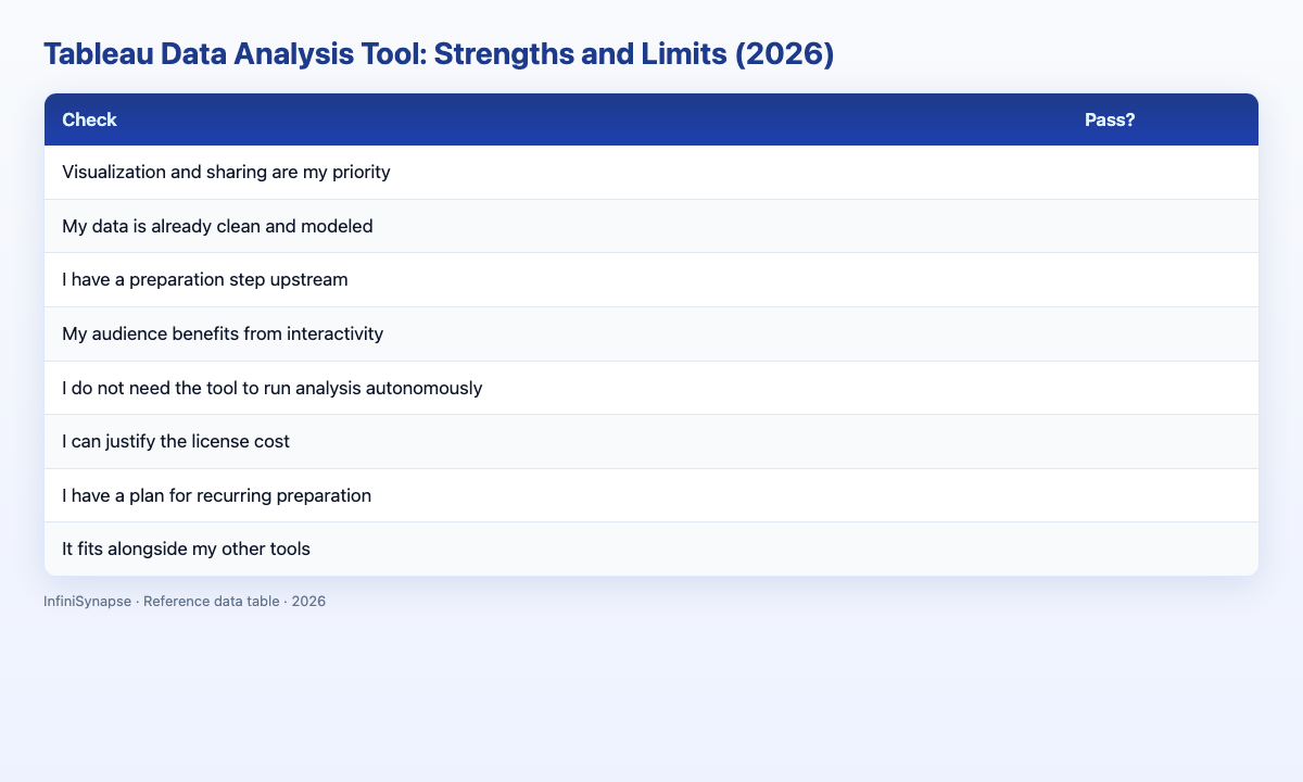
Judge whether the Tableau data analysis tool fits your need (1 point each):
| Check | Pass? |
|---|---|
| Visualization and sharing are my priority | |
| My data is already clean and modeled | |
| I have a preparation step upstream | |
| My audience benefits from interactivity | |
| I do not need the tool to run analysis autonomously | |
| I can justify the license cost | |
| I have a plan for recurring preparation | |
| It fits alongside my other tools |
6–8: strong fit. 3–5: fine with a preparation partner. Below 3: reconsider the stack.
Practical Next Steps
Verify against real job postings
Before committing time or budget, pull five recent job postings in your target market and list the SQL, visualization, and communication skills each repeats. Align your learning plan to those patterns rather than a generic syllabus.
Frequently Asked Questions
Is Tableau a good data analysis tool?
Tableau is an excellent data analysis tool for visualization and dashboard sharing, with best-in-class charts and a gentle drag-and-drop model. Its limits are data preparation and autonomy, so it works best paired with a preparation step or an AI-native agent that produces clean, modeled data for it to visualize.
What is Tableau best used for?
The Tableau data analysis tool is best used for turning clean, modeled data into interactive, shareable dashboards for a wide audience. It excels at visual exploration and distribution but is not designed to clean messy data or run multi-step analysis on its own.
What are the limits of Tableau as a data analysis tool?
The main limits of the Tableau data analysis tool are weak data preparation, no autonomy, and the assumption of clean input. It renders what you build rather than planning analysis itself, and it has no memory of prior analyses, so recurring setup repeats.
Tableau vs Power BI: which data analysis tool is better?
Tableau generally leads on visual polish and flexibility, while Power BI leads on price and Microsoft integration. Both are strong visualization tools that assume clean input, so the better data analysis tool depends on your ecosystem, budget, and how much visual flexibility you need. Official comparisons should reference Tableau help and Power BI documentation.
How does an AI-native agent complement the Tableau data analysis tool?
An AI-native agent connects private sources, cleans and joins data, and runs multi-step analysis, then hands the prepared dataset to Tableau for visualization. The agent covers preparation, autonomy, and memory—the gaps of the Tableau data analysis tool—while Tableau handles polished presentation.
Conclusion
The Tableau data analysis tool is a best-in-class visualization and sharing layer whose limits are preparation, autonomy, and memory. Judge it by the job it was built for, keep a preparation step upstream, and treat it as one strong component of a stack rather than the whole answer.
To cover the preparation and analysis Tableau leaves to you, an AI-native agent is the natural partner. See how AI-native data analysis works and try the InfiniSynapse web app free on registration, no credit card required.